From 12% to 68% Patient Engagement: Designing for the Invisible User (The Caregiver)
The Beautiful App Nobody Was Using
Summer 2024 - The Call from Rachel
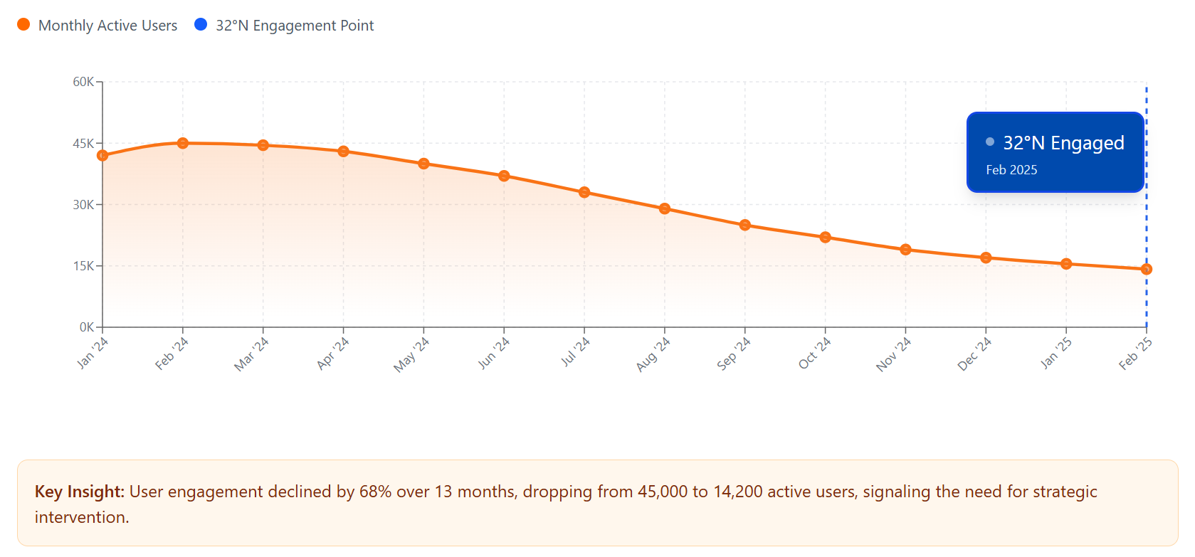
HealthSync had everything going for them: $8M Series A funding, Apple's "Apps We Love" feature, partnerships with healthcare systems, and a waitlist of organizations wanting to license their platform. They had one problem that threatened everything: 12% weekly active users.
"We have a beautiful product. Everyone loves it in demos. But our actual engagement is terrible. Healthcare partners are being polite, but they're not renewing pilots. We've tried everything: better onboarding, push notifications, gamification, incentive programs. Nothing moves the needle. Our investors are getting nervous. We need to understand what's really happening."
Rachel Morrison, VP of Customer Success
She shared the context: HealthSync was built around a clear vision of empowering patients with chronic conditions to take control of their health. The founding team believed deeply in patient agency and self-management. The platform was thoughtfully designed for that vision. But the engagement data told a different story. Rachel had a hypothesis she couldn't quite prove: "I've been looking at our highest-engagement users. Something's off about the pattern, but I can't put my finger on it. That's why I'm calling you."
Project Timeline: 40 Days End-to-End
From initial research to development handoff, we completed:
Week 1-2: The User Research That Surprised Everyone
We started with what we always start with: watching actual users.
Session 1 - Tuesday, 2:30 PM
We'd scheduled a Zoom session to watch Carmen Lopez, 68, use the HealthSync app to manage her Type 2 diabetes.
A woman in her 40s appeared on screen.
"Hi, I'm Maria, Carmen's daughter. My mom's taking her afternoon nap. But I can show you how we use the app. I'm the one who actually uses it."
We clarified: "Does Carmen have trouble with technology?"
Maria laughed: "No, she just doesn't care about the app. She wants to feel better. She doesn't want to track things. I log her blood sugar, track her medications, schedule her appointments, message with her doctors. She couldn't care less about the platform. I'm the one managing everything."
Session 2 - Thursday, 10:00 AM
David Chen, 73, CHF patient. His son Kevin joined the call.
Kevin: "Dad has the app on his phone technically. But he can barely read the small text, and honestly, he gets confused by all the features. So I installed it on my phone too. I manage his medications, track his vitals, handle all the appointments. I'm the actual user."
Session 3 - Friday, 3:00 PM
Patricia Williams, 52, managing her mother's COPD.
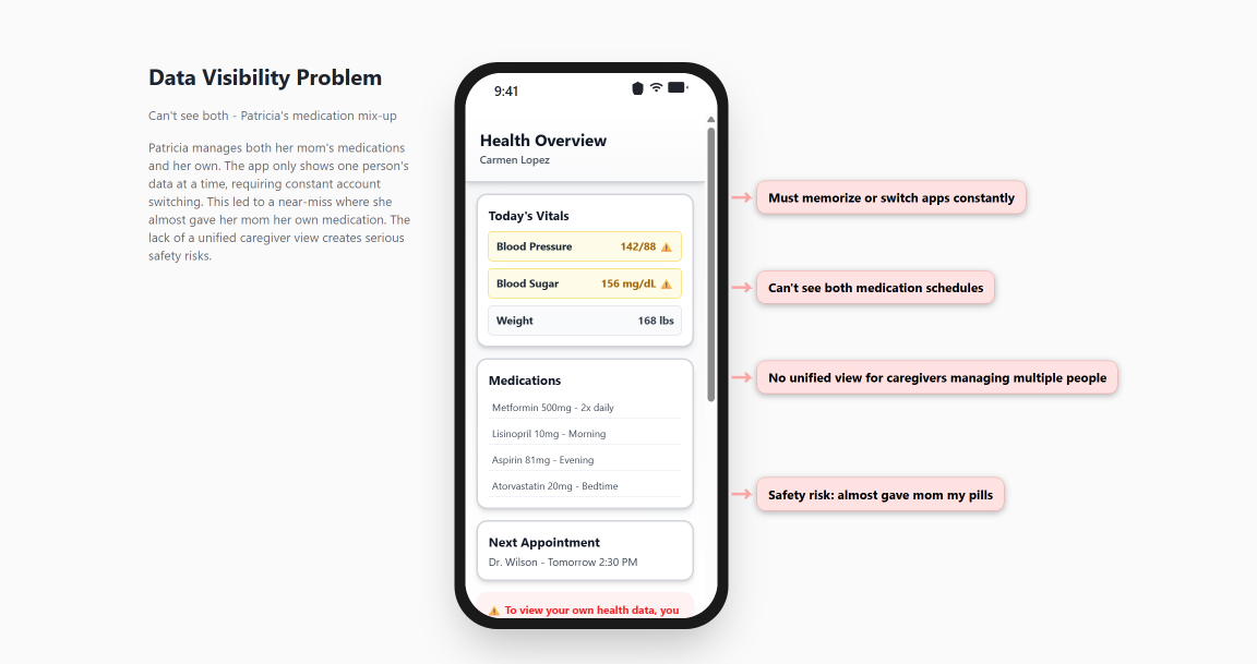
Patricia was direct: "This app is designed for someone with unlimited time and energy. I'm managing my mom's health between work meetings and picking up my kids. I need 'update vitals' to take 30 seconds, not 5 minutes. And I really need to see her medication schedule and her appointment calendar on the same screen instead of navigating through three different menus."
Key Finding
By Session 7, we had a clear pattern: 70% of "patients" using the app were actually family caregivers.
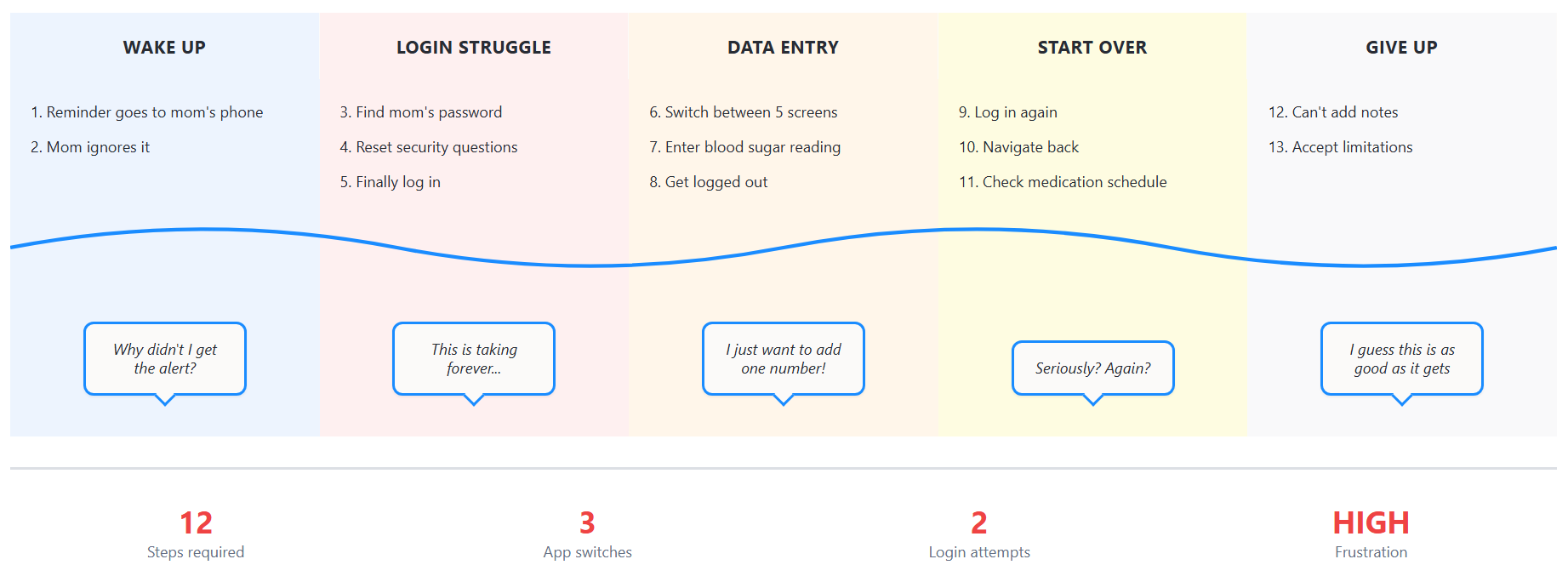
Current Journey: Frustrated & Overwhelmed
Time to complete: 8.7 minutes
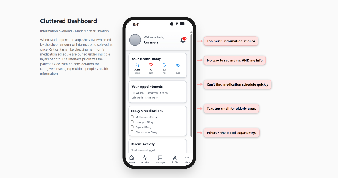
The Interface That Worked for Patients, But Failed Caregivers
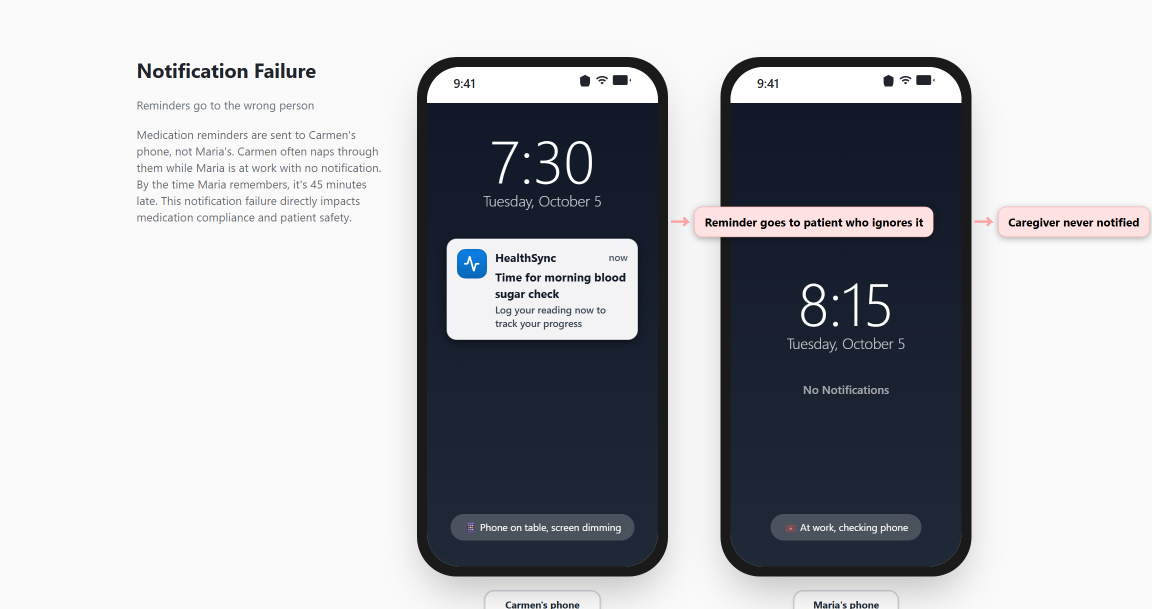
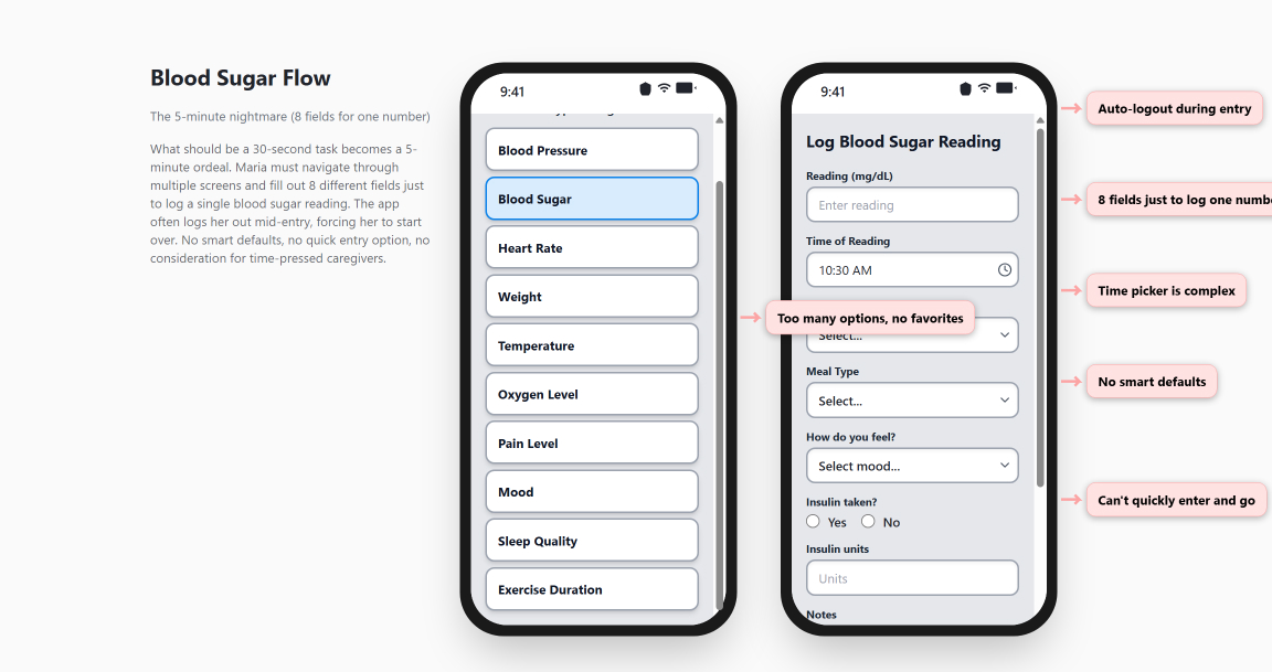
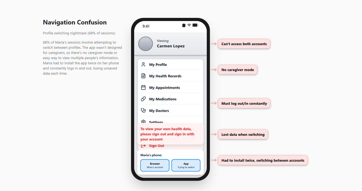
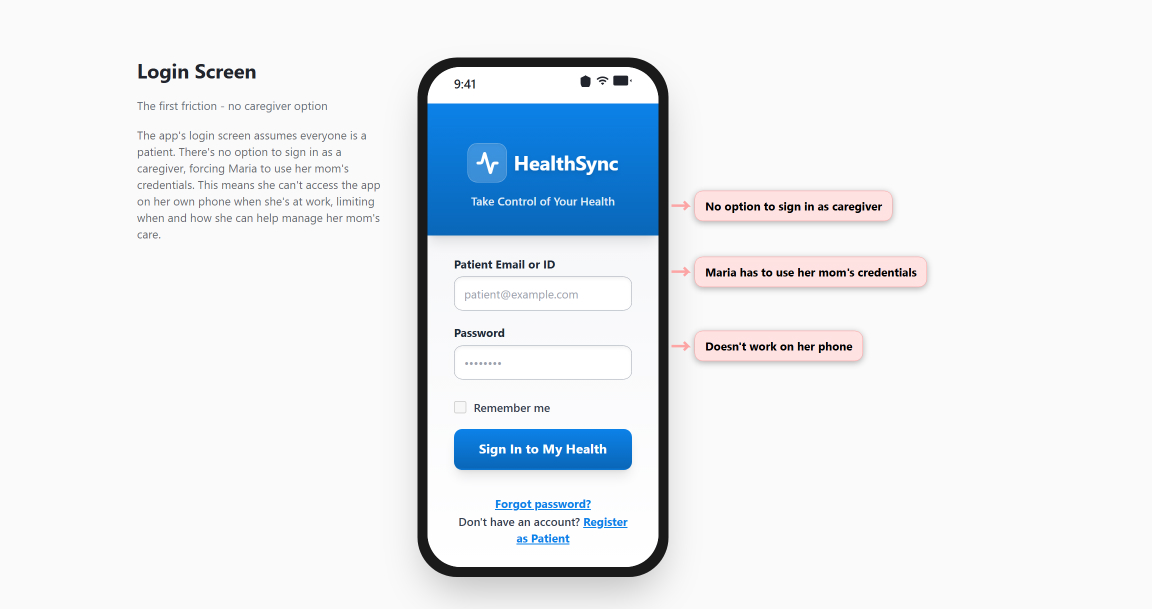
The patterns from our research sessions weren't abstract complaints. They were specific, recurring pain points with real interfaces. Below are the key screens Maria, Patricia, and Kevin encountered daily, annotated with their actual struggles. These designs weren't broken for single patients managing their own care. They broke when real caregivers tried to manage multiple people under time pressure.
Week 3: Validating the Discovery
We went beyond user sessions. Rachel gave us access to support tickets, session recordings, and usage analytics.
We used AI to analyze 847 support tickets from the past six months (traditional manual analysis would take 2+ weeks; we completed it in 2 days).
The Findings
Support Ticket Analysis
of support tickets mentioned "helping my mom/ dad/ spouse"
requests to "Add another person to the account"
complaint: "Can't see their information and mine at the same time"
Session Recording Analysis
of sessions showed profile switches between different people
Average user managed 1.8 patient accounts
Peak usage time (caregiver hours, not patient hours)
RM"Of our 15 highest-engagement 'patients,' 12 are actually caregivers managing someone else's care. And they're the ones who complete care plans, show up for appointments, and don't churn. I knew something was different about them. Now I know what."
Rachel Morrison, VP of Customer Success
Week 4: Presenting the Findings
We prepared a comprehensive presentation for the leadership team: Marcus Chen (CEO), Sarah Kim (Head of Product), and Rachel.
The data was clear, but the implications were challenging. HealthSync's entire platform, brand positioning, and product vision centered on "patient empowerment." What we were showing them was that their actual power users were caregivers, not patients.
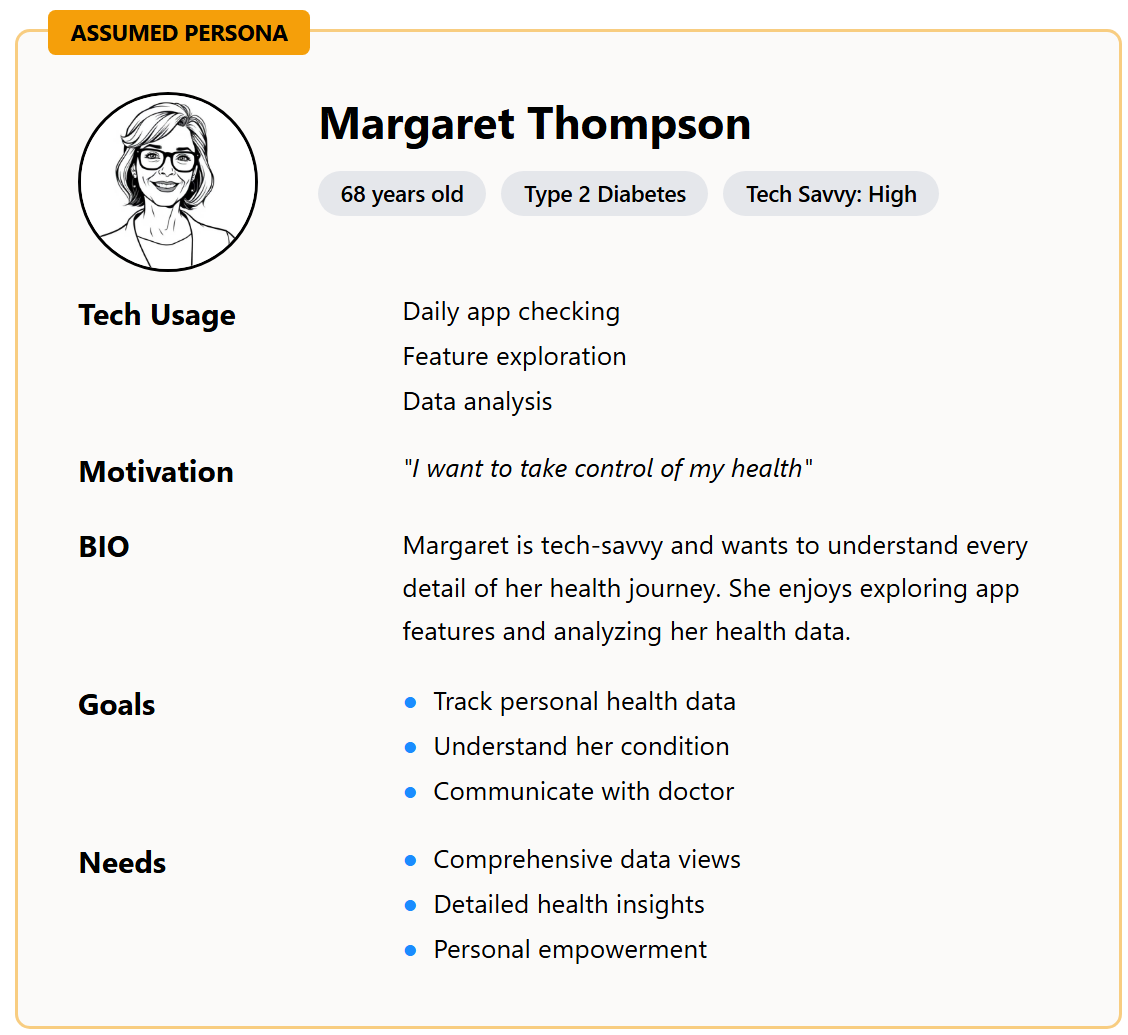
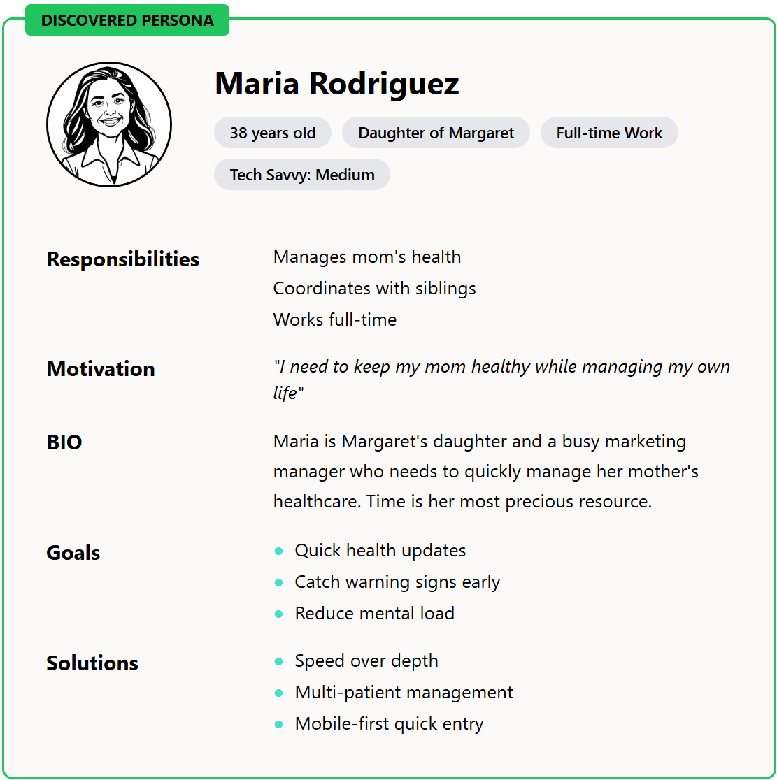
Assumption vs. Reality
Discovering our actual users transformed everything
Leadership Response
Marcus Chen
CEO
Marcus asked thoughtful questions about methodology, appropriate for a CEO evaluating data that challenged founding assumptions:
"How confident are we that this isn't selection bias in who agreed to participate in research? What does the broader usage data show?"
We walked through the support ticket analysis, session recordings, and usage pattern data: comprehensive coverage of the entire user base, not just research participants.
Sarah Kim
Head of Product
Sarah raised the practical concern:
"Our entire platform architecture is built around single-patient accounts. Adding multi-user support with appropriate permissions, privacy controls, and medical proxy considerations. We're talking about significant development work."
Reflection
The tension was understandable. This wasn't just a UX problem. It was a fundamental product strategy question.
Week 5: The Strategic Conversation
Marcus asked for a few days to think through the implications. When we reconvened, he'd clearly been processing the data seriously.
Marcus Chen
CEO
"I've been reflecting on what we learned. The vision of patient empowerment isn't wrong. But it's incomplete. We built for who we hoped our users would be. The data shows us who they actually are."
Rachel Morrison
VP Customer Success
"What if we think of this as expanding our addressable market? We're not abandoning engaged patients who want to self-manage. We're properly serving the massive caregiver market we didn't know we already had. And the retention data is clear. They're our best users."
Sarah Kim
Head of Product
"If 70% of our active users are caregivers and they retain at twice the rate of patient-only users, we need to serve them properly. The question is how we do this without rebuilding everything from scratch. We need a phased approach that works with our current architecture."
The Decision
"Let's move forward. Work with 32°N on a design approach that adds caregiver support without breaking what currently works. Keep our patient-focused features, add what caregivers need. Rachel, coordinate the cross-functional team."
Marcus Chen, CEO
The Collaborative Design Process (Days 15–35)
Understanding Caregiver Workflows
Working with the HealthSync product team, we analyzed the patterns:
- ✓8 core caregiver workflows different from patient self-management
- ✓Different notification needs (caregiver needs reminders, not patient)
- ✓Privacy complexity (HIPAA compliance + family dynamics)
Multi-User Architecture Planning
With Sarah's engineering team, we mapped out scenarios:
- •Single patient, single caregiver (baseline)
- •Single patient, multiple caregivers (siblings coordinating parent care)
- •Multiple patients, single caregiver (managing spouse and parent)
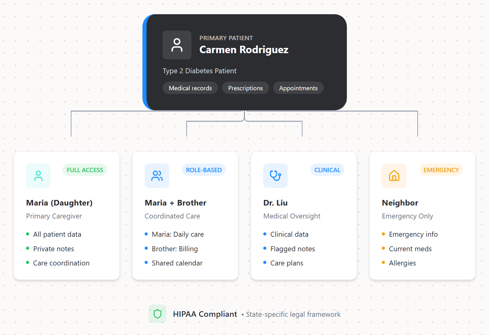
- •Medical proxy scenarios (legal authority varies by state)
Multi-User Architecture
Supporting different caregiver-patient relationships
Sarah's concern about complexity was valid. We were essentially adding B2B2C capabilities. AI-accelerated prototyping let us test different approaches weekly instead of monthly, keeping the timeline manageable.
Testing with Real Families
This was critical. We tested with actual families, not individual users.
Rodriguez Family Test
Maria and Carmen (mother/daughter) tested the prototype together.
Maria: "I can log her blood sugar from my phone without switching accounts. This is so much faster than what I was doing."
Carmen: "I don't understand what's happening, but Maria seems happy."
That exchange validated our approach: The patient doesn't need to understand the system. The caregiver does.
Image Placeholder
Wireframe evolution series - Low-fi sketches → Mid-fi wireframes → High-fi screens, showing the "Quick Update" flow refinement across iterations
Williams Family Test
Patricia testing while managing both her mother's COPD and her own hypertension.
Patricia: "Wait. I can see both my mom's medications and mine in one view? Do you know how many times I've almost given her my pills by mistake because I was switching between screens?"
Image Placeholder
Interactive prototype screenshots - Before/after mobile screens showing fragmented single-user view vs. unified caregiver dashboard with annotations
Implementation Strategy
Sarah's team was clear: we couldn't force-migrate existing users to a new paradigm.
Our Solution: "Invite to Care Circle" Feature
- ✓Existing patients could invite family members
- ✓New capability added to current system
- ✓Caregivers got full caregiver-optimized interface
- ✓Patients who wanted to self-manage could continue unchanged
Marcus appreciated the approach: "This doesn't say our original vision was wrong. It makes our platform more inclusive of how healthcare actually works in families."
What Worked: The Features That Transformed Engagement
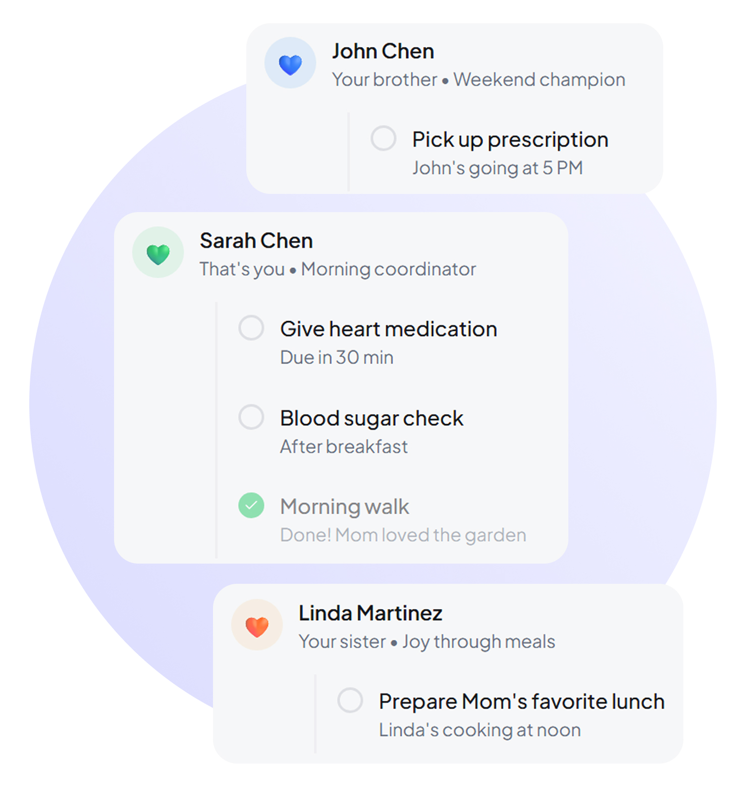
"Care Circle" Concept
Description
- •One patient, multiple authorized caregivers
- •Granular permission levels (medication management, appointment scheduling, medical records access)
- •Each caregiver customized their view based on their role
Patricia: "My brother lives three states away but handles her insurance and billing. I do the day-to-day care. We both need access, but we need different things. This finally makes sense."
Context-Aware Notifications
How It Works
System learned to notify the right person:
- •Caregiver gets medication reminders when they're administering
- •Patient gets appointment reminders when they can independently attend
Maria: "My mom would ignore every notification. Now I get them, and I actually take action. Her blood sugar logging went from 40% compliance to 92% compliance."
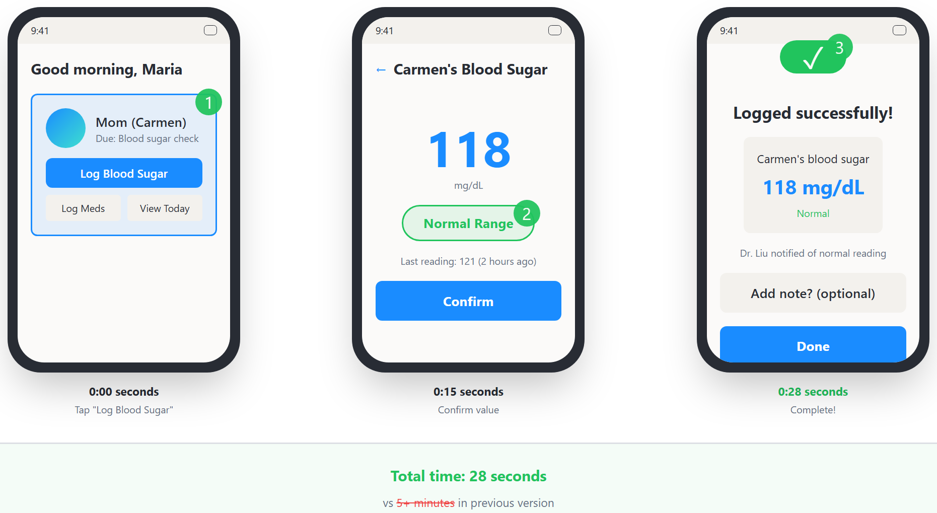
Quick Update Mode
The Problem It Solved
Understanding caregivers operate under extreme time constraints:
The Solution
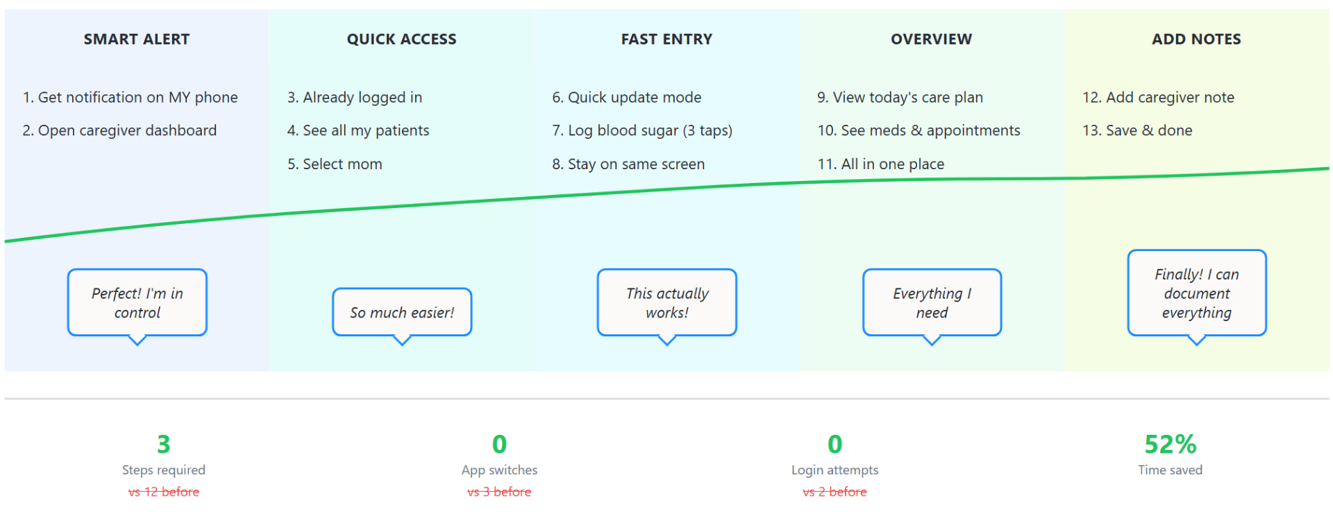
- •Three taps: Open app → log vital → done
- •Auto-categorizes as normal/abnormal based on patient baseline
- •Flags concerning values for provider review
Kevin: "I can update Dad's blood pressure while microwaving lunch. That's the speed I need or I just won't do it."
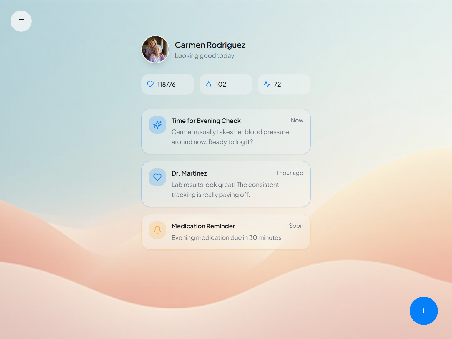
Unified Dashboard
What It Shows
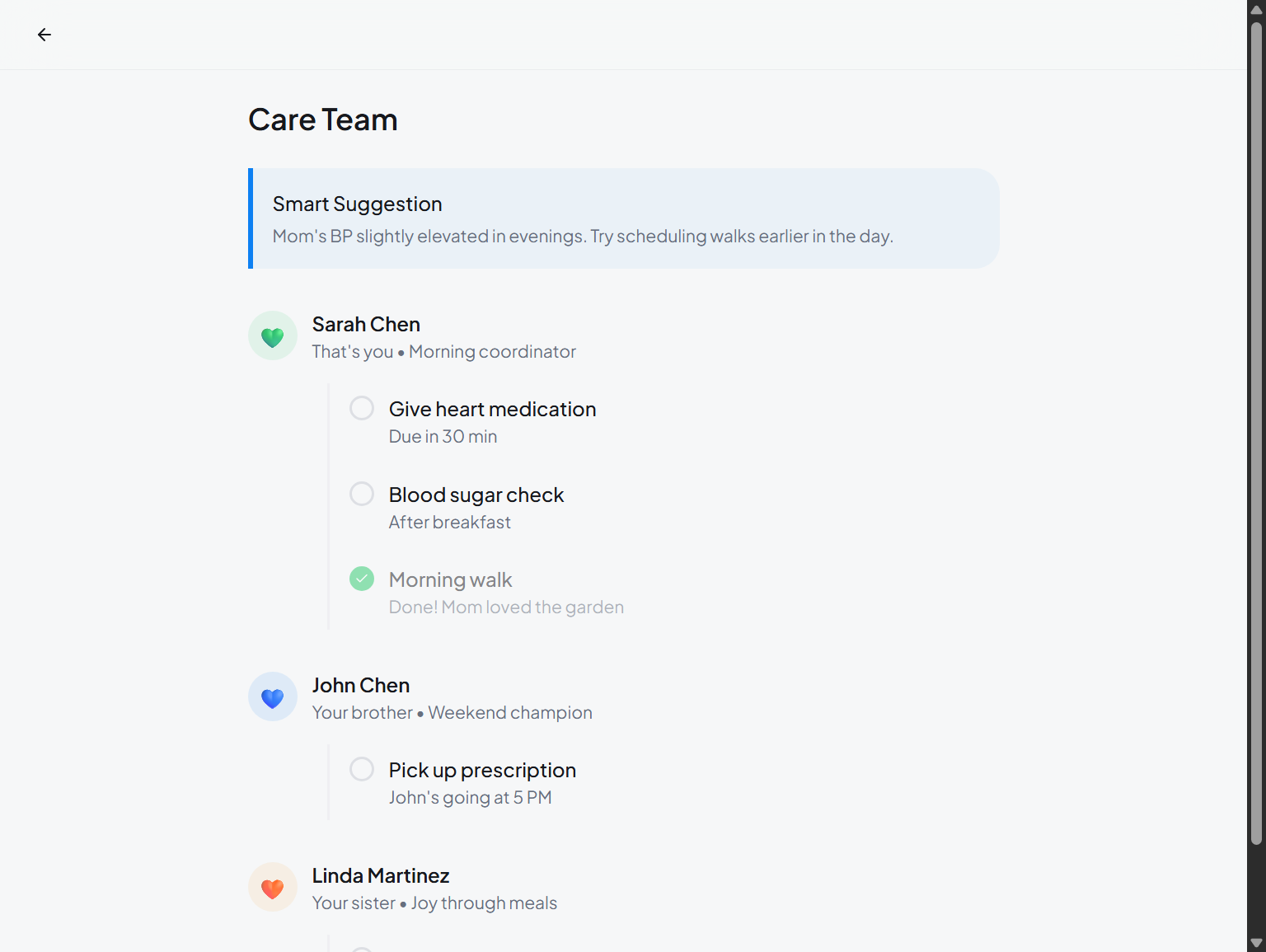
Caregiver view showed:
- •All patients they manage in one place
- •Color-coded status indicators
- •One-screen overview instead of constant switching
Private Caregiver Notes
Why It Was Requested
During testing, multiple caregivers asked for this:
- •Track observations not appropriate for medical records
- •"Mom seemed confused today, possible UTI"
- •"Refused morning meds, will try again at lunch"
Maria: "I can track patterns and share with the doctor when relevant, but I'm not cluttering her official medical chart with every daily observation."
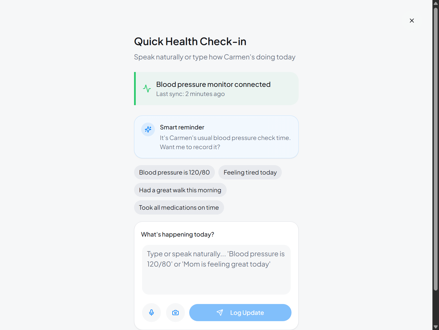
Designing for Reality: The Interface That Caregivers Actually Needed
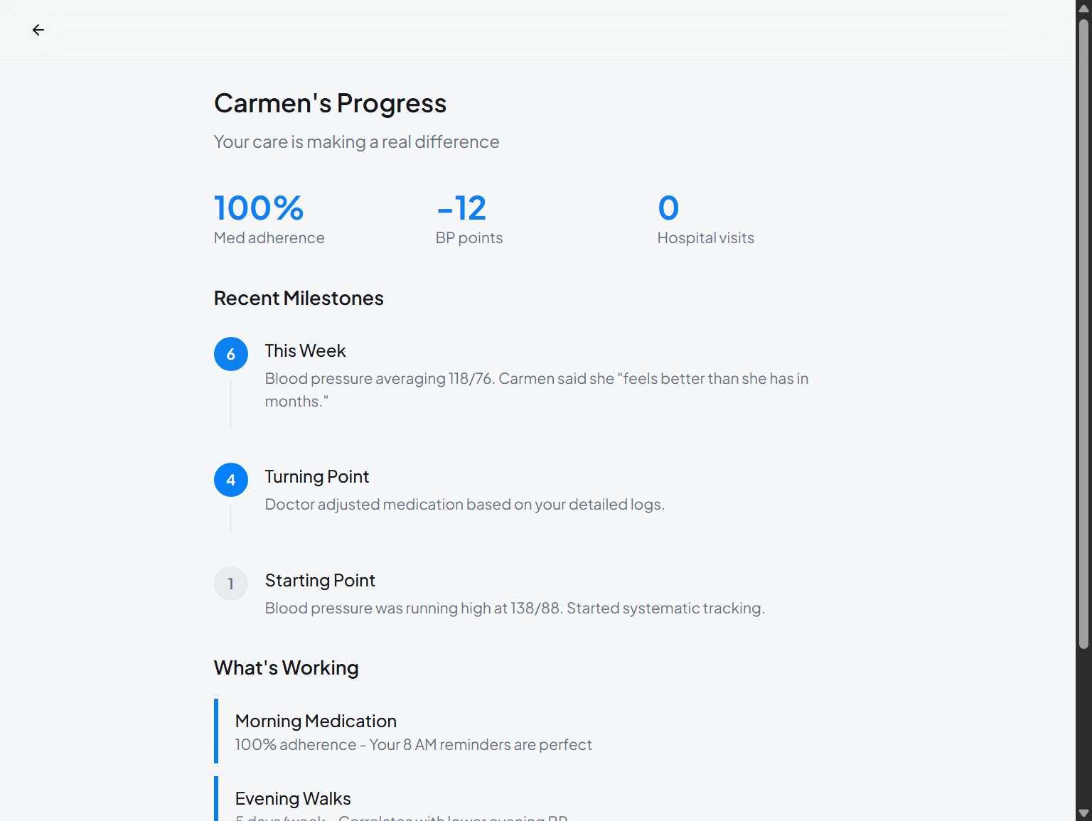
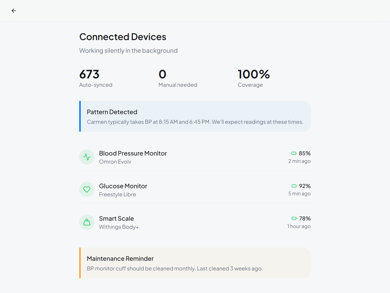
Five core screens that reduced mental load, saved time, and turned struggling users into power users
What We Learned
Behavior Reveals Truth More Than Stated Intentions
Everyone, patients, caregivers, the founding team, believed in the vision of patient empowerment. But actual usage patterns told a different story.
The insight: Always validate product assumptions against actual user behavior, not just stated preferences.
The "Primary User" Isn't Always Obvious
In B2B, the buyer isn't the user. In B2C healthcare, the account holder often isn't the primary user. Family caregiving is invisible in most product planning.
Convenience Is Non-Negotiable for Caregivers
Beautiful, comprehensive interfaces got ignored. "Good enough" quick-entry options achieved 92% adoption.
The reality: Caregivers operate between work meetings and family obligations. Every second matters.
Privacy Has Multiple Dimensions
HIPAA was the baseline. Family dynamics added complexity:
- •Sibling conflicts around parent care
- •Balancing patient dignity with caregiver information needs
- •Different comfort levels with medical information sharing
Domain-Specific Challenges
Medical Proxy Laws Vary by State
- •50 different state legal frameworks for healthcare proxy
- •Some states require notarized documents; others accept digital consent
- •Interface needed flexibility without compromising legal compliance
Caregiver Burnout Is Real
40% of family caregivers experience depression. Every feature had to answer: "Does this reduce mental load?"
Not just: "Can they complete the task?" But: "Can they complete it without feeling overwhelmed?"
Medication Tracking Liability
Required legal consultation for:
- •"Logged by caregiver" vs. "administered by caregiver" language
- •Handling discrepancies between patient and caregiver reports
- •Clear liability boundaries in documentation
IoT Device Data Reliability
Blood pressure cuffs, glucose monitors, scales. All transmitted data automatically. Except when they didn't, or when data was corrupted.
Solution:
- •Data confidence indicators
- •Manual override with note field
- •Anomaly flagging ("reading unusual, please verify")
Kevin: "The system flagged Dad's blood pressure as 210/140. I checked manually. 135/85. He'd put the cuff on upside down. Without that verification prompt, I might have called 911 unnecessarily."
The Transformation (6 Months Later)
Engagement Metrics
Weekly Active Users
New Signups Identify as Caregivers
Caregiver Retention at 6 Months
Avg Session Time (down from 8.7)
Healthcare Partner Response
Three health systems that had been considering ending their pilots renewed for full deployments.
Dr. James Liu, CMO of Riverside Health
"We've tried multiple chronic care management platforms. HealthSync's evolution to properly support family caregivers addresses how chronic care actually works in patients' lives. This is the first platform that matches reality."
Business Impact
Hospital readmission rates for chronic disease patients using HealthSync
Why? Caregivers caught warning signs early and coordinated with providers before crises occurred.
Team Reflections
Marcus Chen, CEO
"This project taught our team to hold our vision lightly enough to let data reshape it. The caregiver market was hiding in plain sight in our user base. Working with 32°N helped us see what we'd been too close to notice."
Rachel Morrison, VP Customer Success
"The retention data told the story. Caregivers were our power users all along. We just hadn't designed for them intentionally. Now we have."
User Impact
Maria Lopez
Daughter & Primary Caregiver
Managing mother's Type 2 Diabetes
"For the first time since my mom's diagnosis, I feel like I have tools that actually help me help her. I'm not constantly drowning."
Patricia Williams
Working Caregiver
Managing mother's COPD while raising teens
"My therapist asked what changed. I seemed less stressed. I told her about the app. She's now recommending it to all her caregiver clients."
Kevin Chen
Son & Care Coordinator
Managing father's CHF
"Dad's doctor said his care compliance is the best she's seen. She asked what changed. I showed her the app."
Dr. James Liu, MD
Chief Medical Officer
Riverside Health System
"This is the first chronic care platform that matches how care actually works in patients' lives. HealthSync's caregiver support addresses the invisible reality."
Unexpected Outcomes
Organic Community Growth
The platform's community feature, originally designed for patient peer support, became a thriving caregiver network.
Over 200 active groups formed organically:
- •"Managing dementia in aging parents"
- •"Type 2 diabetes care for reluctant patients"
- •"CHF care coordination for working caregivers"
Market Category Creation
HealthSync's evolution created recognition of a new category:
Family Care Coordination Platforms
Marcus: "We thought we were falling behind competitors. Turns out we were creating a new market segment."
Project Credits
The 32°N Difference
This case study demonstrates Thirty Two North's approach to product-market fit: combining rigorous user research with strategic flexibility to serve users as they actually are, not as we imagine them to be.
Sometimes the biggest design insight is identifying who should actually be using the product.
By completing the entire process, from discovery to validated designs, in just 40 days, we helped HealthSync transform a failing product into a category-defining platform. Our AI-accelerated design process, combined with deep healthcare domain expertise, delivered speed without sacrificing quality.
Transformed Journey: Confident & Efficient
Time to complete: 4.2 minutes • 52% faster
Names and identifying details of users, caregivers, and some team members have been changed to maintain privacy and confidentiality. Healthcare partner organizations have been anonymized. All product features, design decisions, metrics, and business outcomes described are accurate representations of the actual project. The HealthSync platform and its caregiver-focused capabilities are live and serving real families managing chronic conditions.
They already shipped with us
Ready to turn 11%
adoption into 68%?
Thirty minutes. We will tell you what is actually broken, and whether we are the right people to fix it.
We've told people to build internally when that made more sense.
We named it that for a reason.